

The NBA Needs a Uniforms Czar
The NBA Needs a Uniforms Czar
Sometimes centralized authority is good

Courtesy of Cdog91 via Wikimedia Commons
In each human heart lurks an authoritarian impulse. Sometimes it’s channeled into devilish things: conquering nations, silencing enemies, or other great injustices. Other times it manifests in the pint-sized tyrannies of the parish council president and the 8th grade football coach. Often it’s mostly harmless. The unique flavor of each person’s urge to control aspects of the world around them is influenced by a mélange of experience-spices so subtle that speculation about Why They Do That is largely pointless—even when we speak about ourselves. However, it is also fun. And in any case, I think the NBA needs a uniforms czar.
The uniforms czar’s job would be a simple but important one—choosing each team’s uniform for every game. At the moment, these decisions are made by the teams themselves, which is like letting your toddler choose their own outfit before your court hearing. Occasionally it works. Usually it doesn’t. The uniforms czar would also be responsible for selecting the home team’s floor colors, a vital element for ensuring everything else pops. The NBA’s uniforms czar would have no input on any other aspect of the game, but when it comes to sartorial choices their authority would be Stalinian.
The NBA needs a uniforms czar because the league has a problem: too many of its games are, for all intents and purposes, unwatchable. Ethan Strauss of the Athletic, who writes at length about the NBA’s TV ratings, recently noted that “premium network TV games” hit an all time low last year. This year the ratings are even lower. The NBA’s press releases might boast that X million viewers still tune in—despite these uncertain times—but only a fool would be fooled. The league is so desperate for revenue that team owners are pushing for more expansion franchises (and more importantly, the billions of dollars in buy-in money from the prospective owners of said franchises). Some of the cities considered for expansion, like Seattle and Vancouver, have already proved incapable of supporting NBA franchises even before two global recessions in little over a decade.
Maybe that’s fine. We’ve all done dumb things for quick cash, and often the consequences aren’t as catastrophic as we might imagine. But if the NBA’s owners want networks to pay $75 billion for the privilege of televising basketball games, their case would be much stronger if people were actually watching the games.
There’s a key question we haven’t covered yet—why are people losing interest in watching the NBA? You’ll be shocked to hear this: there’s no single answer. Maybe, like Strauss suggested in an earlier column, it’s because fans don’t connect with new foreign superstars like Luka Dončić or Giannis Antentokoumpo. Maybe they hate the data-driven, heliocentric style of play that has turned so many contests into 3-point brickfests interrupted only by trip after trip to the foul line. Maybe they’re turned off by instant replay and zone defenses. Maybe the season is too long. Maybe fans have become so numbed by the cruel stupidity of the world that they no longer find joy in anything, even a Mikal Bridges dunk.
Or maybe people are getting sick of watching the NBA because the aesthetics of many games are ugly, and people want their entertainment to be pretty, which is why the NBA needs a uniforms czar.
To be clear, I have no interest in the job. All I desire is for someone who shares my general principles to be the NBA’s uniforms czar, because I think those principles are reasonable:
The Uniforms Should Vibe With Each Other
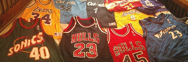
If Bubba Blue was into merchandise instead of shrimp, he’d be an NBA jersey man. You got your Classic Edition, your City Edition, your Icon Edition, your Earned Edition, your Association Edition. And that’s about it (for most teams), but it’s still a far cry from when teams stuck to homes, aways, and maybe an alternate if they were frisky. Today, it’s no longer possible to determine who is playing in a given game solely by the colors of the two teams’ uniforms.
This is not necessarily a bad thing. Yes, the proliferation of technicolor team jerseys is a blatant cash grab as the NBA seeks to expand its $1 billion merchandise market. And yes, it’s a mockery of the troops when the Utah Jazz wear orange. But this is the world we live in. If the uniforms must exist, then make them match.
For example, observe the visual splendor of this game between the Miami Heat and the Los Angeles Lakers:
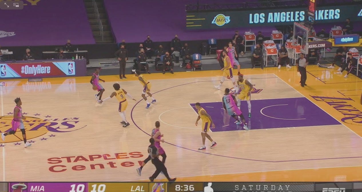
The basketball gods must have wept in rapture at such a sight. The Heat, who languished for years with dull black-and-red uniforms that looked like they were designed by A.J. Soprano, have started to atone for their sins with the gorgeous Vice collection. Neon pink! Neon blue! Coked-out Neapolitan (my personal favorite, pictured above)! With five beautiful colors to choose from, Miami has the versatility to match up with any team in the league. Mix a little Miami Vice with some Lakers gold (plus that court), and you have a recipe for visual bliss. Who cares if the game turns into a 20-point blowout? Like an episode of Planet Earth, the prettiness is the point.
Now, contrast that image with this Heat game against the Atlanta Hawks:
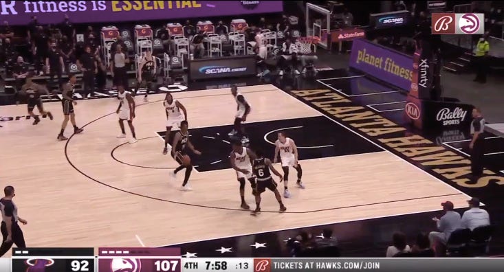
What the fuck is this? How did two teams with such vibrant colors (Hawks red is A+) end up playing a game that looks like it was set in Grapes of Wrath? Watching a blowout is never fun, but with the right aesthetics it can at least provide a soothing backdrop to more entertaining activities. This? This is not fun. This is a crime against style. I hate what has been done to my soul.
Such things could never occur if the NBA had a uniforms czar. All they’d need to do is take one quick look at each team’s wardrobe, pair the aforementioned Hawks red with Miami’s baby blue, and allow greatness to flourish.
Some Risks Should Be Taken (and Some Avoided)
As the Heat illustrate, being an NBA uniforms czarist does not mean being a hidebound traditionalist. While not every new jersey is a winner—military camouflage is always a bad look—there are enough hits to make up for the misses. This is good news for fans because it means more permutations of home-and-away color combos. Some of these might be a bit unsettling at first, like a bite of chili-infused chocolate. But like all acquired tastes they can soon prove addictive.
Consider the Charlotte Hornets’ mint-colored uniforms:
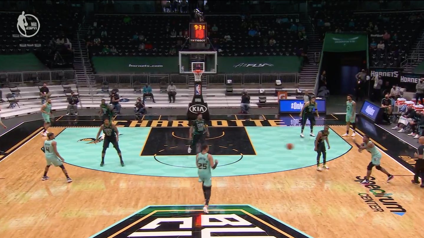
I did not expect to like the mint. I did not want to like it, to be honest. On a visceral level it reminds me of the mid-’90s NFL expansion teams in Carolina and Jacksonville, or one of those sickly sweet chocolate squares. Boston’s black uniforms have always seemed bad as well, though in a different way. They’re the kind of alternates a team gets when their marketing department has no real ideas other than playing someone else’s hits. Inexplicably, somehow the combination of the two just kind of works.
On the other hand, sometimes you end up with this:
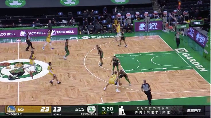
No! No, no, no! Boston’s iconic Celtic green uniforms are often praised as some of the best outfits in all of sports, and there is simply no justification for the unforced error of not wearing them on Boston’s own fucking court. Look at the verdant hue of the paint and sidelines. Look at the sparkling yellow of Golden State’s threads. The universe is crying out for the union to be completed. The Warriors held up their end of the bargain, but the Celtics? The stripes and the socks are just a tease. By not giving us the full show, they do a disservice to the sport itself. When Brad Stevens & Co. get bounced in the first round, it’ll be richly deserved.1
Needless to say, such nonsense wouldn’t fly under the uniforms czar. A true professional would never miss the opportunity for a delicious green-and-gold matchup—the kind of game that makes you consider investing in a 100” TV and a pound of aromatic herbs. Do the people responsible for blunders like the one above deserve to be sent to some kind of reeducation camp in Secaucus, New Jersey? I do not wish to speculate about this. But perhaps yes.
Tank-tops and Shorts Don’t Need Narratives
If you’ve ever worked with a graphic designer, you may have been surprised to learn that even the simplest shape or font has a Story behind it. When the government of Ontario paid a design firm $650,000 to create a logo for the Canadian province’s new weed dispensaries—a logo that was little more than a black-and-white circle with “OCS” in the middle—the reaction from the general public was, “Lol you serious?” But where you or I might see drudgery, a sophisticated design aficionado can see a whole bunch of pompous, imaginary shit.
Many NBA teams have their own equivalents of the Ontario weed dispensary debacle, but few are as visible (or annoying) as those of the Brooklyn Nets. The franchise’s black-grey-and-white color scheme is uninspiring in all its manifestations. But its City Edition uniforms are especially bad. To the untrained eye, they look as if they were designed by someone who just heard about the concept of graffiti and wasn’t totally sure they liked it but went ahead and made some prints anyway. “Blasphemy! These uniforms were inspired by the late Brooklyn-based painter Jean-Michel Basquiat! He is regarded as one of the most influential artists of the 20th century!” That’s very interesting. I have nothing against Mr. Basquiat or his work. Much of it is indeed quite cool (and expensive).
But some things just don’t translate to uniform design, and sanitized street art is one of them. It’s understandable why the Nets went in this direction, of course. Minimalist graffiti with some wacky accent colors will get you more applause among tastemakers than, say, a teal-and-purple swamp dragon. Like an artisanal IPA, the combination of “local” and “artist” makes for an easy sales pitch in the current social climate. Some people might complain about the dreary, predictable sameness of these allegedly edgy creations, but they can be dismissed as a bunch of whiny purists.
Other trends are less corrosive to the NBA Viewing Experience™, though. A prime example is when teams experiment with twists on tertiary colors. You don't need an overproduced YouTube video to tell you what the uniform means and why you should like it—that ooooo feeling is generated by your own optic nerves. Just take a look at the spectacular parakeet threads of the Utah Jazz:
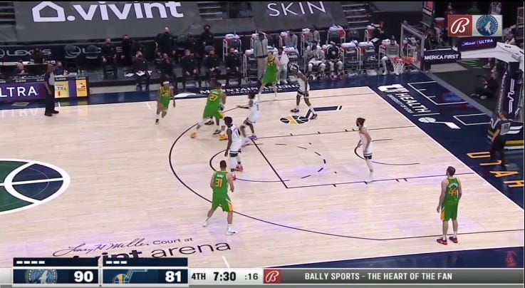
The Jazz’s uniforms alone elevate the visual appeal of this game from a D+ to a solid B. Even with the Marriott Extended Stay-ass court and the equally dreary duds of my hometown Minnesota Timberwolves, there’s something alive in this image. Using an accent color as the main attraction can make a matchup work, even if it shouldn’t.
While monochrome minimalism might’ve overstayed its welcome by a half-decade or so, a kind of colorful neo-minimalism is now starting to spread, and it has much more panache. Once again, you don’t need someone to explain to you why these uniforms are neat. You know it when you see it:
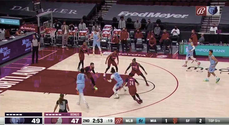
Neither the Memphis Grizzlies’ blue uniforms nor the red ones of the Portland Trailblazers have much in the way of design flair. But the rich, bold colors are enough on their own. There’s something comforting about the simplicity. If the NBA had a uniforms czar, such low-hanging fruit would be plucked on a nightly basis, and we would all feast on the sweet eye pleasures.
A Few Final Thoughts
The notion of an NBA uniforms czar has occupied a growing percentage of my brain capacity over the past few weeks. It provides relief from contemplating more serious problems, though I don’t want to overstate my interest in the matter. It’s not an obsession, exactly. I don’t think my life (or anyone else’s) would be significantly better if the league did appoint someone to make sure the next Clippers-Nets game doesn’t look like it’s being broadcast in 1953.
But the idea of making small, simple tweaks to create more beauty in the world is an appealing one. As it gets harder and harder to imagine our society changing for the better in any significant way (our leaders certainly don’t seem interested in this), we have two choices: surrender to despair, or seek to influence our corners of existence as best we can. Or maybe we have more choices as well. A thing may be invisible to us yet still exist. There’s subatomic particles and shit, if you’re into that. I don’t know.
In any case, the NBA would be more fun to watch if the league had a uniforms czar. That will probably never happen, because it would require teams to surrender some of their autonomy, and humans hate surrendering autonomy even when it’s clearly in their best interests.
Still, the minute we stop dreaming our souls begin to shrivel. And so the dream of an NBA uniforms czar is one worth keeping—if only to imagine a world in which monstrosities like these are banished to hell, where they belong.
If you would be interested in reading a many-thousands-of-words rant about why the Boston Celtics are the worst part of 21st century basketball, please let me know.